
I don’t think I’ve ever thought this hard about fonts before. I mean, when I was a kid sure, I’d play around with wingdings or whatever weird fonts and pretend I was writing in a secret code that only I (and anyone else with Microsoft Word) could understand. But I’d never really thought about it in my adult life beyond making sure that a school assignment didn’t have a required font for submission. Yet here we are.
I’m generally better at purely visual things, and while I’d at least noticed more “design” type decisions on marketing materials or ads, fonts were something that just, were. So for the mood font project I was truly in uncharted territory (for me that is). I started by just listing out some words. After I’d made a list with maybe ten different words on it, I sketched out some basic ideas for what a font that fit each particular word might look like. Unfortunately for posterity’s sake, my dog decided the paper I’d brainstormed on had excellent mouth feel. in the absence of an actual copy, I’ve provided the picture at the top of this post as a re-enactment of my desk while working.
I attempted to create my own graphics from scratch for some of the words, but quickly discovered that my graphical abilities were not close to mature enough to produce anything I’d want to share with the world. So after much scrolling through long lists of different fonts, I found some that fit my visions for the different words and, with the help of my wife and dog, narrowed it down to three fonts per word for six different words. Here’s the first three words:
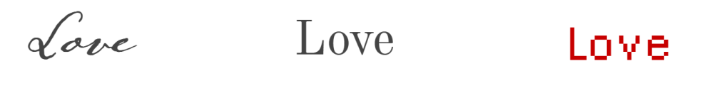
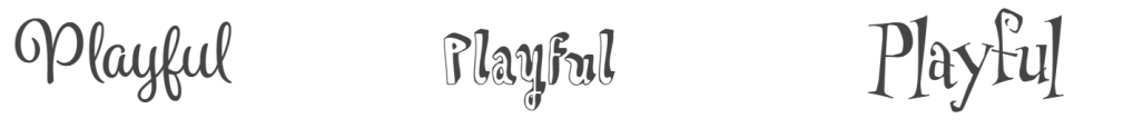

I tried to make sure that each font was different and displayed a different side of the chosen word, or at least had a different feel while still capturing the spirit of it. Love was an interesting one to work with. The three options that made it represented three different “types” of love. The first one was akin to the script in a love letter. Flowy, beautiful, and reminiscent of handwriting. The second one struck me as a sort of “conservative” take on love. Simple and traditional, which ironically, “tradition” also made the cut as one of my chosen words. The third option for love, I tried to go the other way and chose a modern, digital-looking font. I was going for a vibe that fit the kind of purely remote kind of love you might find on a dating site. Some of the words I had less luck being philosophical and was mainly just went with fonts that just “felt right” to me, such as my choices for “playful”.


I had a little more fun with these last three words. Fear was almost too easy and I almost didn’t go with it for that reason. There’s a number of fonts that were almost certainly made with “fear” directly in mind. Confused was an interesting challenge. The whole point of words and fonts is to convey meaning. Confusion and writing are almost antithetical concepts. I tried to go for fonts that almost rode the edge of unreadable without actually being unreadable. My thinking for lost was something like a person lost in the woods. Like trying to send signals with only primitive tools and rocks. A cry for help almost. The last one was my take on feeling “lost” in the modern world. Small and insignificant.
Moving away from pairing fonts with words was the type specimen project. I knew pretty quickly what font I wanted to do the poster on. Times New Roman was a font (or really “typeface” I guess) I felt like I’d grown up with. Writing school assignments or starting books I’d never get anywhere close to finishing (barely even started really). TNR was always there for me. I miss it honestly. Sure, it’s not as modern or readable as sans-serif options like Calibri, but it has a classic and comfortable feel to it. And that’s the feel I went with when making the poster. Classic, timeless, comfortable.
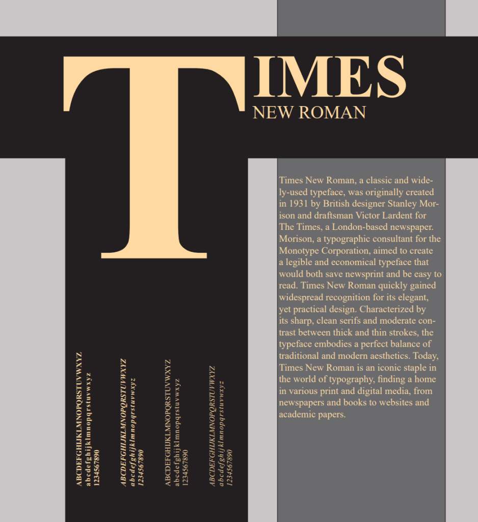
After writing up my own heartfelt eulogy to the rarely used, but never forgotten typeface, I fit it onto a simple poster with clean lines. I tried several variations of the poster with more complexity to them, but I always found the more complex the design the less it felt like Times New Roman to me. In the end, the above image was the result.
I rounded out this weeks projects with an assortment of business cards and one letterhead. Nothing too fancy here, I took the logos, fonts, and colors I’d made/chosen for Durham Dari Serv and mocked up some different options.


It was mostly stuff like this. I can’t really say I was completely satisfied with them, but I was struggling with InDesign, which I found both confusing in its interface and quite limited in abilities. Whether that was due to the program actually being limited or just my own lack of experience with it I don’t know enough to say. I’ll probably focus mainly on Photoshop and maybe try to learn Illustrator on future work.

Leave a comment