Specifically, that’s what the three assignments were this week. The overall theme was about images. And what better way to explore images than to make them? Well, at least assemble them. It took me a while to figure out what I wanted to do for my projects. I found that for this assignment, the “pre-planning” phase took as long as the actual designing and making. I just couldn’t settle on an idea for the mood boards especially. I initially had the thought of using the military as the “establishment” for the mood board. My time in the Navy certainly gave me plenty of inside experience with it. There are plenty of ways I thought of to take that. I could do a mood board for each of the different branches, but for some reason that felt too… I don’t know, easy? And a propaganda page wasn’t what I was going for either. Ironically I did end up using the navy to make a propaganda brochure for the brochure assignment, but I did have my reasons for that one. My other military idea, and the one I spent the most time on, was to try to tell the “story” of the military from three different perspectives. First, the military through the lens of what the government wants the public to see the military as. Basically propaganda. The second would be the military from the perspective of the working within it. Monotonous and routine. And third, the military from the perspective of those on the, well, receiving end. Dirty, terrifying, and often unasked for. But despite running through lots of pictures for it, I just couldn’t find an arrangement that satisfied me. Especially the third board. Balancing just how much honest brutality I showed just wasn’t working out the way I planned. And frankly, I had misgivings about it being too political.
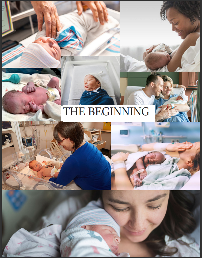
What I finally settled on was a topic more related to my current schooling: medicine. I chose, rather than a particular company or establishment, to do boards on “the hospital” as an aggregate. As much as we may try to avoid hospitals, for obvious reasons, lots of people spend those most defining moments, the beginning, and the end of our lives in hospitals. So I thought of using the three boards as telling a story of our lives, from the perspective of a hospital. Broken into three parts, the beginning, the middle, and the end. The beginning was the easiest part to do. It’s often the most joyous part (not including those unspeakable occasions where all three parts are tragically combined into one, short stay), and of course it’s easy to find cute pictures of new babies.
The next one was a little more vague, but “the middle” was intended to show the many times and for many reasons that we find ourselves in hospitals. Sometimes just waiting to be seen, sometimes visiting others, sometimes as the patient in the bed, and sometimes, for some of us, as medical professionals working there. I didn’t like the name “the middle” very much. It was too obvious and uninspired. In the end, I went with “Intermission”. A throwback to old movies that were too long and needed a break in the middle to recover (off-topic, but lots of new movies are equally long, and would do well to also have an intermission). Hospitals don’t tend to be the most colorful places, but I attempted to at least set up some sort of cohesive gradient of color across the image, with more blue/green at the top and more orange/tan at the bottom.

The final one was, of course, the end. I went a little darker with this one, both literally and figuratively. There’s some light, but it all spirals in towards the center where it fades to black and the titular phrase “The End” appears against the blackness. Loneliness and loss are the primary emotions I was attempting to convey, as these are often the primary emotions that those left in the aftermath feel. What goes on behind the curtain after it fades to black is anyone’s guess. All of us reading this blog are still somewhere in the intermission.

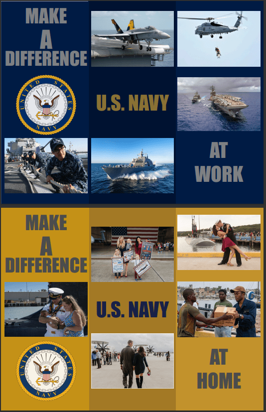
After my dismal ending of the mood boards, I decided to go for some easier content, and keep the brochure simple. I’m sure anyone who’s ever been in military has seen enough of this sort of thing to last a lifetime, but honestly, I had seen so many navy brochures, especially from the short time I worked in a recruiting office, that it seemed like a good break from the hospital. The whole question is really, how do you make something that, at its core, is less than wholesome, and turn into something that you want to be a part of on paper? Well for the Navy, the answer is lots of cool and powerful looking boats and airplanes, and the promise of a fulfilling home life with a loving spouse. I thought I’d give InDesign another shot here, but honestly it still troubles me. I wanted to do some more interesting masking on the photos so they looked less like my 3-year-old daughter had thrown the brochure together in daycare, but I was once again unsuccessful at bending the software to my will, so toddler scrapbook it was. I was glad that I took the advice in the assignment guide and mocked it up on paper first. Getting the folding to work out so the correct page was in the correct spot was less intuitive than I assumed. My first attempt I couldn’t for the life of me figure out how to make the outside parts not be the right-most section. After messing with it for much longer than I’d like to admit, I finally had the epiphany that paper can fold both forwards AND backwards. Things went more smoothly after that. The way I made the brochure it could be both a C-fold or a Z-fold depending the desired look. Either way, once opened it featured one side showing the “work” aspects of the Navy and the other side showing the “home” aspects.
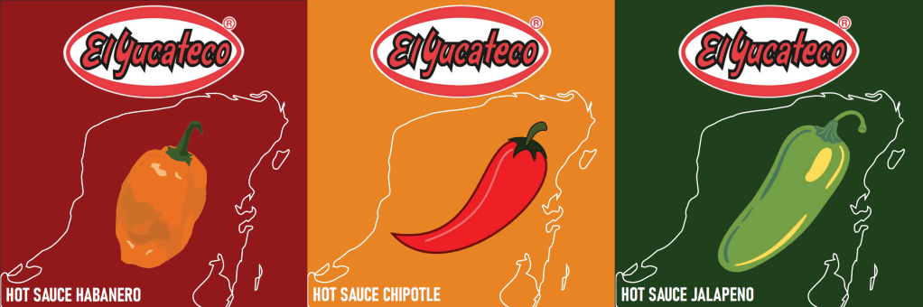
Finally, I started working on the product labels. This was the only part of the assignment that didn’t take me a long time to decide what I was doing. When I first started working on it I was eating tacos with my favorite hot sauce. The solution was clear. El Yucateco is a hot sauce brand that can be found in pretty much every grocery store around here. Their “classic” flavor is the red habanero. It’s quite spicy, but it’s hard to beat the flavor of habaneros. I decided to go with that one (it was after all the one I was eating when I decided) and two other flavors, jalapeno and chipotle. Together, they make up the quintessential “mild, medium, and hot” spread. For the design I went with different, boldly colored backgrounds in green, orange, and red respectively, overlined with an outline of the Yucatan Peninsula, the region of Mexico the hot sauce is named after. In the middle I featured stylized vector art of whichever pepper the hot sauce was based on. To finish it off, I added the companies logo over it all.

Leave a comment