
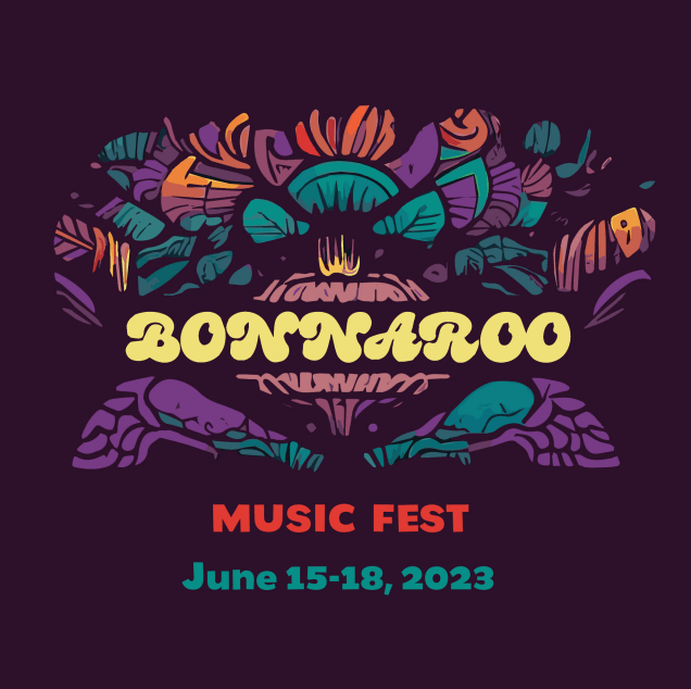
Confession time: I’ve never actually been to Bonnaroo. But I have always wanted too, so that counts right? What better way to imagine I was at a music festival than to make a graphics package for it? Well, probably watching videos of it or something would work better, but that wasn’t the assignment (I watched some videos too though just to get in the spirit of things). This assignment was to create an entire graphics package for a “public event”. As one of the largest music festivals near where I grew up in Tennessee, and one that I still hope to go to one day, Bonnaroo seemed an obvious choice.
In some of my past projects I’d struggled through with InDesign, to somewhat limited success. For this project, I stuck with some of the apps I was generally more comfortable with. I did, however, try something new. I started using Krita and Inkscape with my tablet to draw various general designs. Initially, to make it easier, and to help mask my under-developed drawing skills, I drew it in a lower resolution form. From there, I uploaded to an AI upscaler to add detail and bring the total resolution up to a 4k square image. After I’d tweaked the upscaler settings and gotten an image I liked, I processed it some in Illustrator to clean up the lines and remove some of the AI added “noise”. Once done in Illustrator, it was off to Photoshop where I spent pretty much the rest of my time. I did more cleaning in Photoshop, cleaning up lines, editing some really odd details that the AI added that looked just very… well… AI. Finally, I had a base image that I was satisfied with.
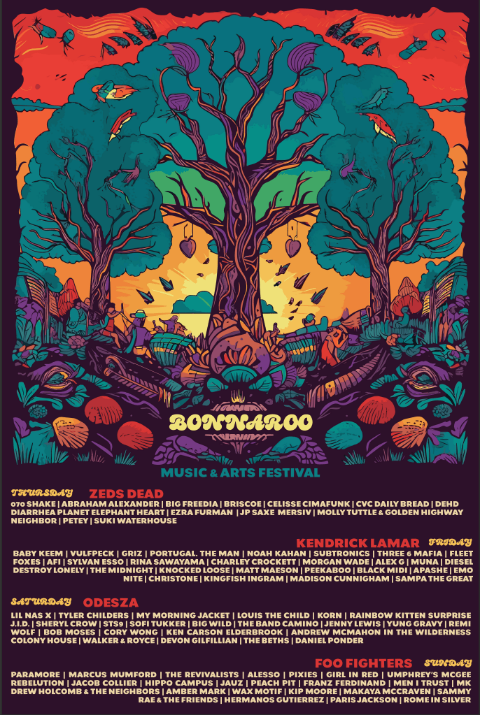
There’s still some oddities that the AI left over, but at this point I’d spent days working on this and was well past my due date. From here though things went quickly. I used this image as the base for all the rest of the assignment items. The poster was the first item I finished, mostly since it used pretty much the complete base image mostly unchanged, except for adding some wording.
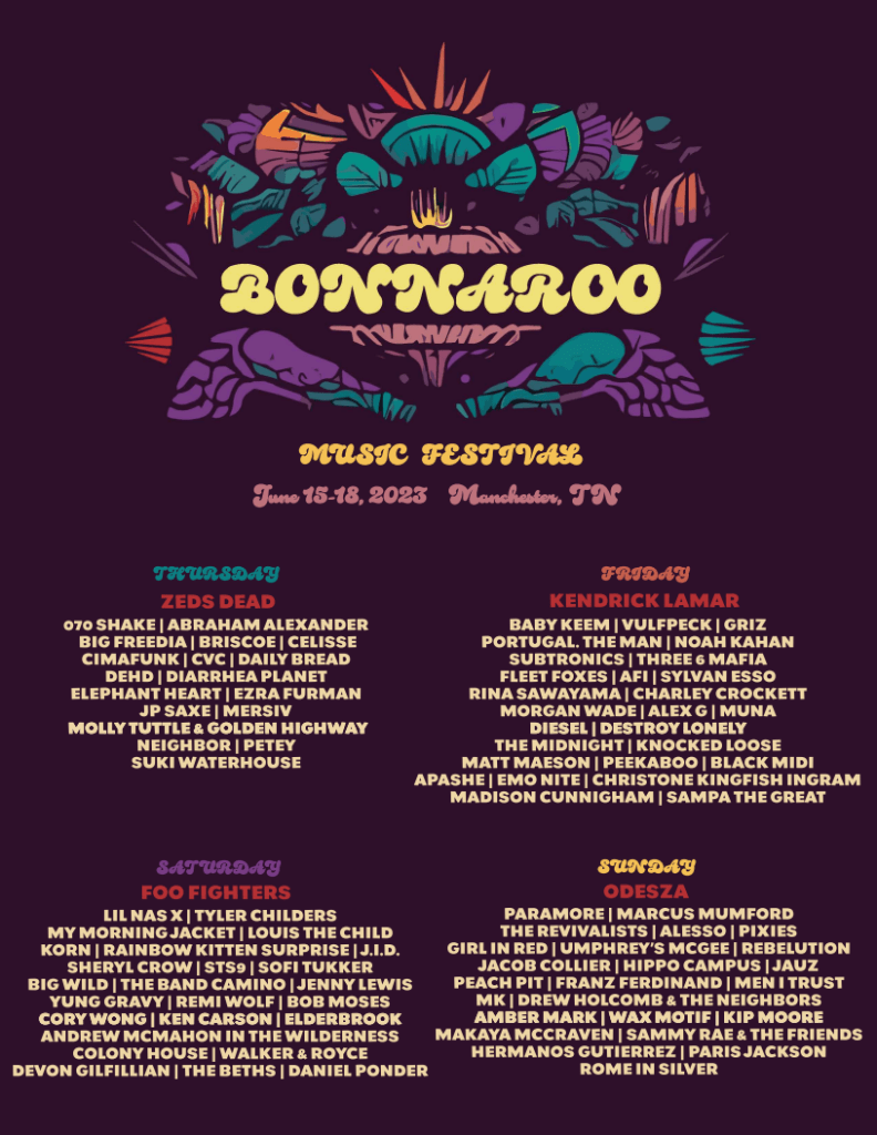
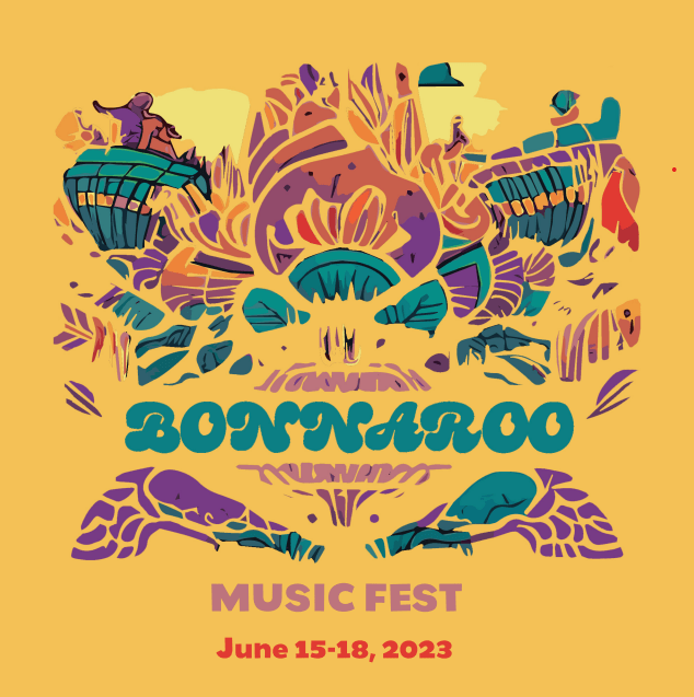
The next was the flyer. It was almost like a minimalistic, toned down version of the poster. The lettering was basically the same, although in a different layout, but the image was heavily edited and simplified.
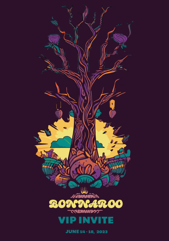
I started on the VIP invite, and honestly, I have no idea what a VIP invite is. That is apparently a social circle that I am completely unaware of. So I made a vertically oriented, skinnier graphic where I leaned more into the minimalism. I was basically trying to go a little “classier” than the other graphics, while keeping the same general color vibe and design. The primary way I accomplished this was by cleaning out the majority of “foliage” off the tree and leaving a bare trunk with limbs. The sun and clouds in the center were also cropped out to give a splash of color and contrast.
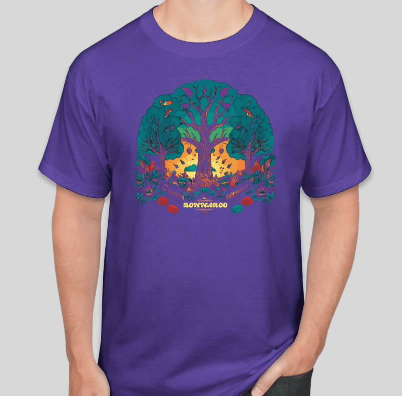
The T-shirt was a fun one to make. I made a version of the base design where I basically cut out the main center tree and trimmed down the edges some to better fit a t-shirt vibe. Unfortunately, the website I used to model the graphic on a t-shirt only allowed me to select from a handful of colors, so the purple isn’t quite the right shade. I think it still worked out for the most part. I made a white version as well, but I felt like it really missed the vibe and I didn’t care much for it.
Lastly, I put together the three Instagram posts. I decided to go for square posts for ease and better fit of the imagery. I decided to change up the base coloring on one of them. I had a tough time getting away from the purple, it just seemed to fit so well.

So that’s it. The majority of my time on this project was spend on creating the initial base image. Once that was done, it was mostly just a matter of editing, cropping, cleaning, and of course, laying it all out.

Leave a comment